In a moment of surprising forethought and planning when I was in high school, I took some drafting classes because I knew I wanted to study art in college, but I also knew that I needed to earn a living. Why not do drafting as my day job? I liked drawing and the tools of drawing, and I was a visual thinker. It seemed like a good fit. This was back when drafting was ink or pencil on vellum or mylar. I eventually did do quite a bit of work in Autocad when it came into common usage.
So while I finished up my college studies, I also worked as an electromechanical draftsperson. I had many jobs over the years, but I had the unique experience of working for an early private enterprise rocket company, and I still do love watching any sort of rocket movie or footage.
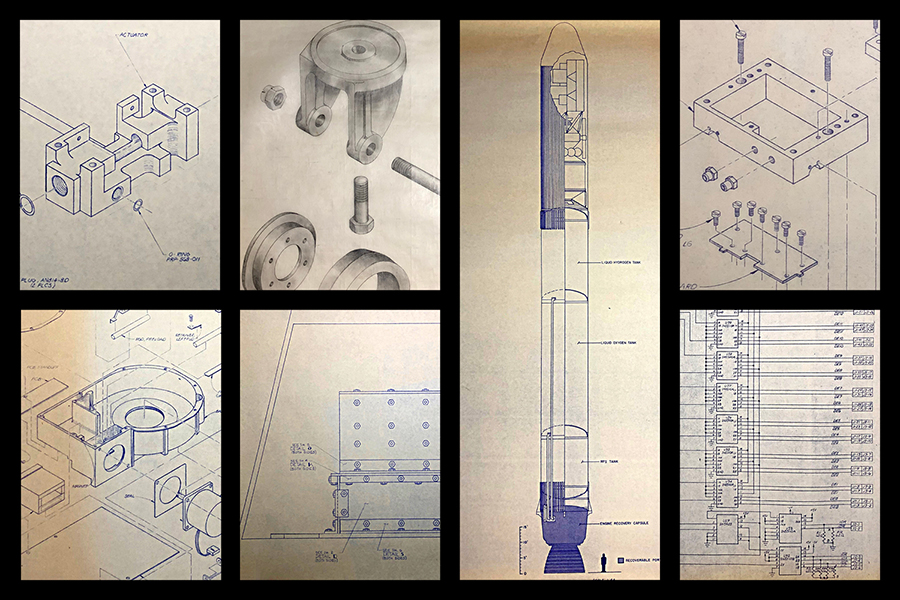
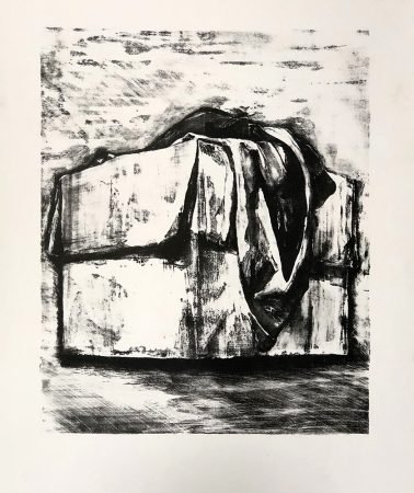
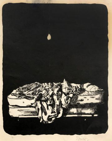
I always tried to keep my drafting job separate from my artwork, but when I look back at my drawings from those days I see quite a bit of draftsmanship in them. The influence is there, like it or not. Drafting rewired my brain for a certain sort of seeing and thinking. Here’s some early lithographs from my college days:
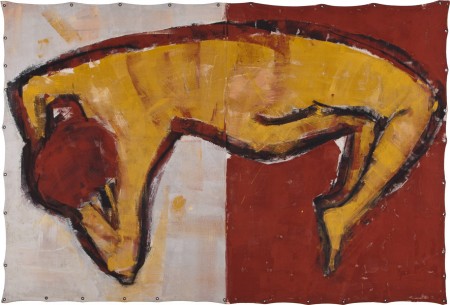
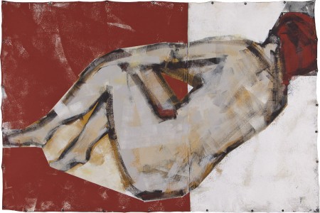
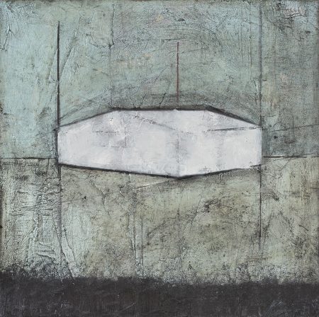
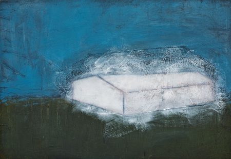
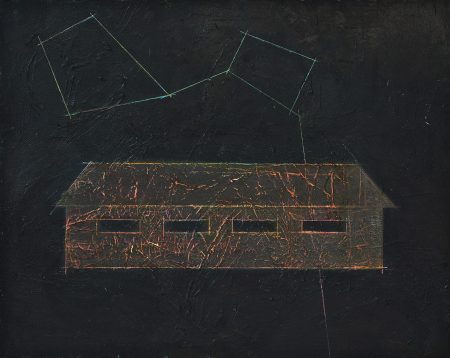
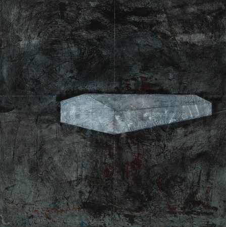
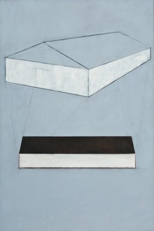
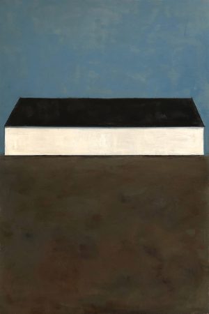
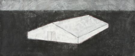
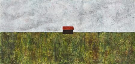
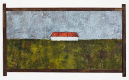
I did manage to veer away a bit from the drafting influence for many years as I did figurative work, though line and edge have and still are always important to me. But I started to embrace the drafting influence in more recent years, using straight lines, centering something on the page, and focusing on a single thing, like a drafting view.
Here are some large-scale tarp paintings illustrating this point, from 2012, mixed-media on 6’x8′ unstretched canvas.
This has got me thinking about the drafting concept of views. In drafting, a specific view of an object is shown: front or side or bottom or cut-away section of 3D orthographic projection. This implies a sort of selective vision, which we all have of course, but it goes without saying that artists present information through their own personal selective “vision” (be it visual or otherwise), showing the viewer something about how we approach the world.
In my case, I’m often trying to show the viewer what it is that I am looking at (and equally important is what it is tht I’m ignoring, but the viewer isn’t privy to that information).
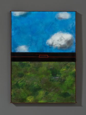
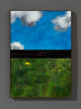
These two pieces are a good example. In Making My Own Paradise (left), I divide the landscape into into three sections: earth, horizon (populated with a man-made structure) and sky. It’s like a drafting view of an object, in a sense, but the object is the entire landscape. I’ve edited out anything that is unimportant in my description of the earth, the horizon, and the sky. In Nothing But Blue Skies (right), I show specific and small areas of sky inside each box. Look here, and now here; look at this and now this. These pieces are currently in an exhibition put on by the European Cultural Centre titled PERSONAL STRUCTURES – Identities in the Palazzo Mora in Venice, Italy, in conjunction with the 2019 Venice Biennale.
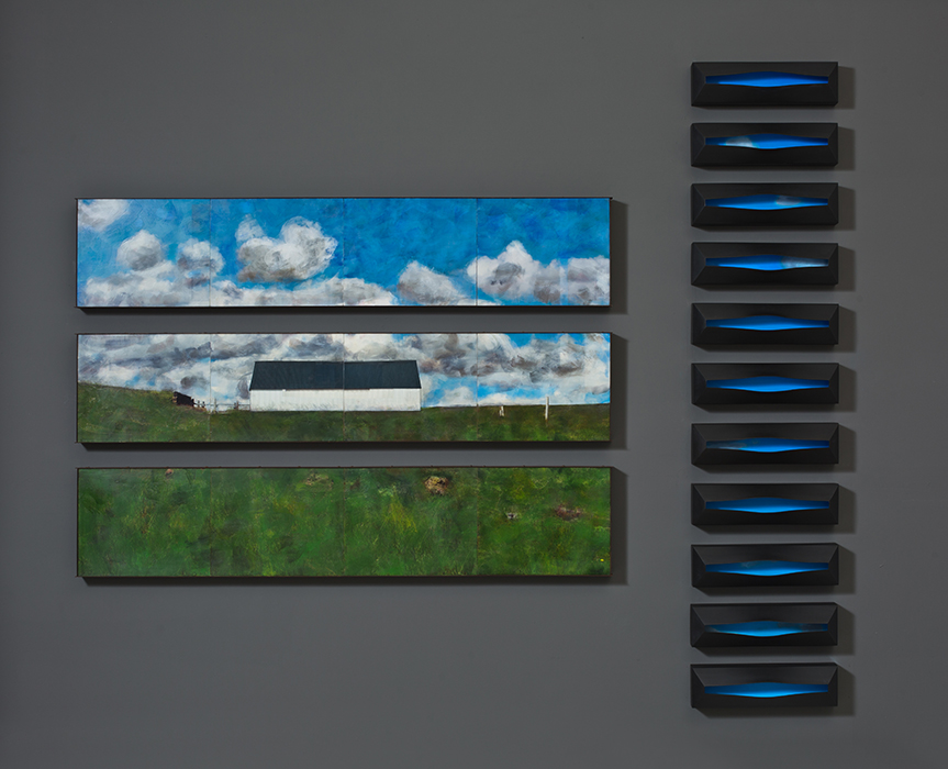
installation for Venice exhibition summer 2019, left: Making My Own Paradise, Right: Nothing But Blue Skies
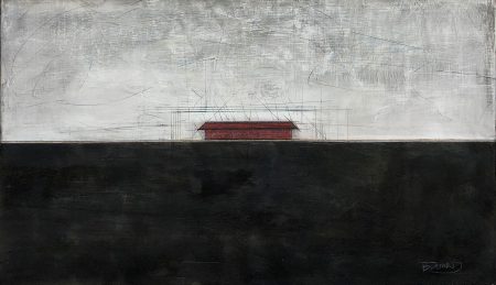
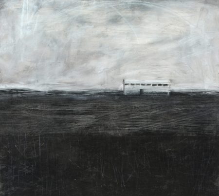
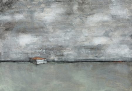
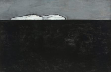
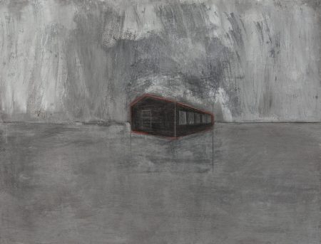
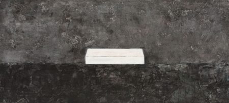
Again, in these pieces below, I split the landscape up into three sections, but I minimized the horizon line with a more ghostly image of the man-made structures within the Icelandic landscape.
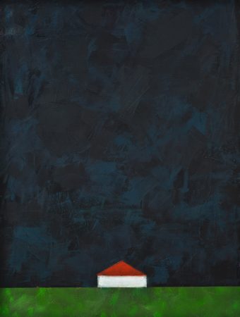
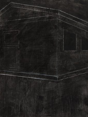
And then there are all these images of barns in Iceland, in perspective, in front views or oblique views, all like drafting drawings with only as much information as needed, and no more.

